 Published: 10 Feb
2025
Published: 10 Feb
2025 5-min read


Table of Contents
INTRODUCTION
Viewport is the area of window in which webpage is currently seen. In terms of web-browser, it is same as browser window and excludes menu bar etc. Its size varies with device, mode and orientation. In CSS there are 6 units based on viewport which are listed below.
- viewport width unit - vw
- viewport height unit - vh
- viewport block unit - vb
- viewport inline unit - vi
- viewport minimum unit - vmin
- viewport maximum unit - vmax
1. viewport width unit - vw
VW stands for Viewport width. It is an unit to measure the width of viewport. VW is equivalent to percentage of viewport width. So 10vw is equal to 10% of viewport width and 100vw is full width of viewport.
Example: consider viewport dimensions as 1920px x 1080px. So 10vw is calculated as 10% of 1920 which is equal to 192px.
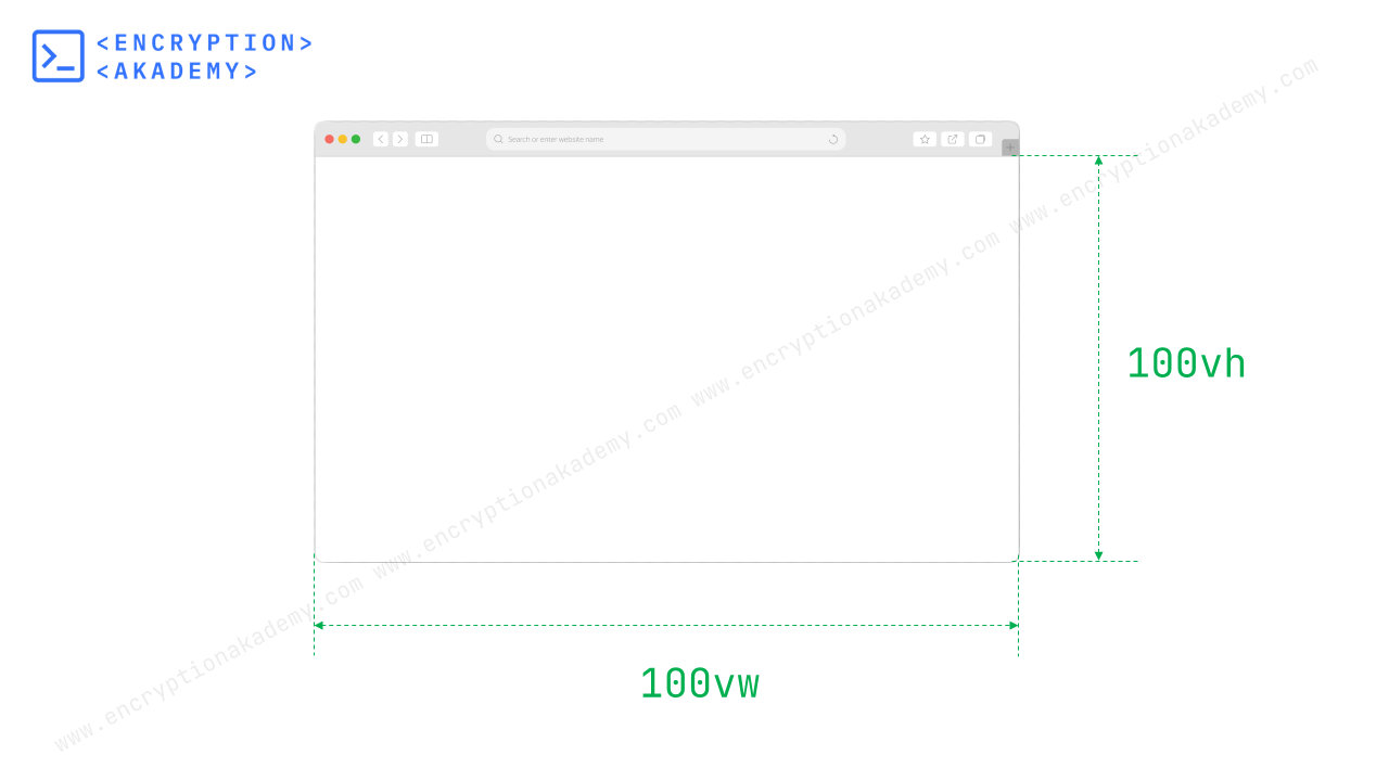
2. viewport height unit - vh
VW stands for Viewport height. It is an unit to measure the height of viewport. VW is equivalent to percentage of viewport height. So 10vh is equal to 10% of viewport height and 100vh is full height of viewport.
For example consider viewport dimensions as 1920px x 1080px. So 10vh is calculated as 10% of 1080 which is equal to 108px.
3. viewport minimum unit - vmin
vmin stands for viewport minimum. This unit refers to dimension of viewport which is smaller(either height or width). 10vmin is equal to 10% of smaller dimension of viewport and 100vmin is full size of it.
Example: consider viewport dimensions as 1920px x 1080px. So vmin here will refer to 1080px and 10vmin is calculated as 10% of 1080 which is equal to 108px.
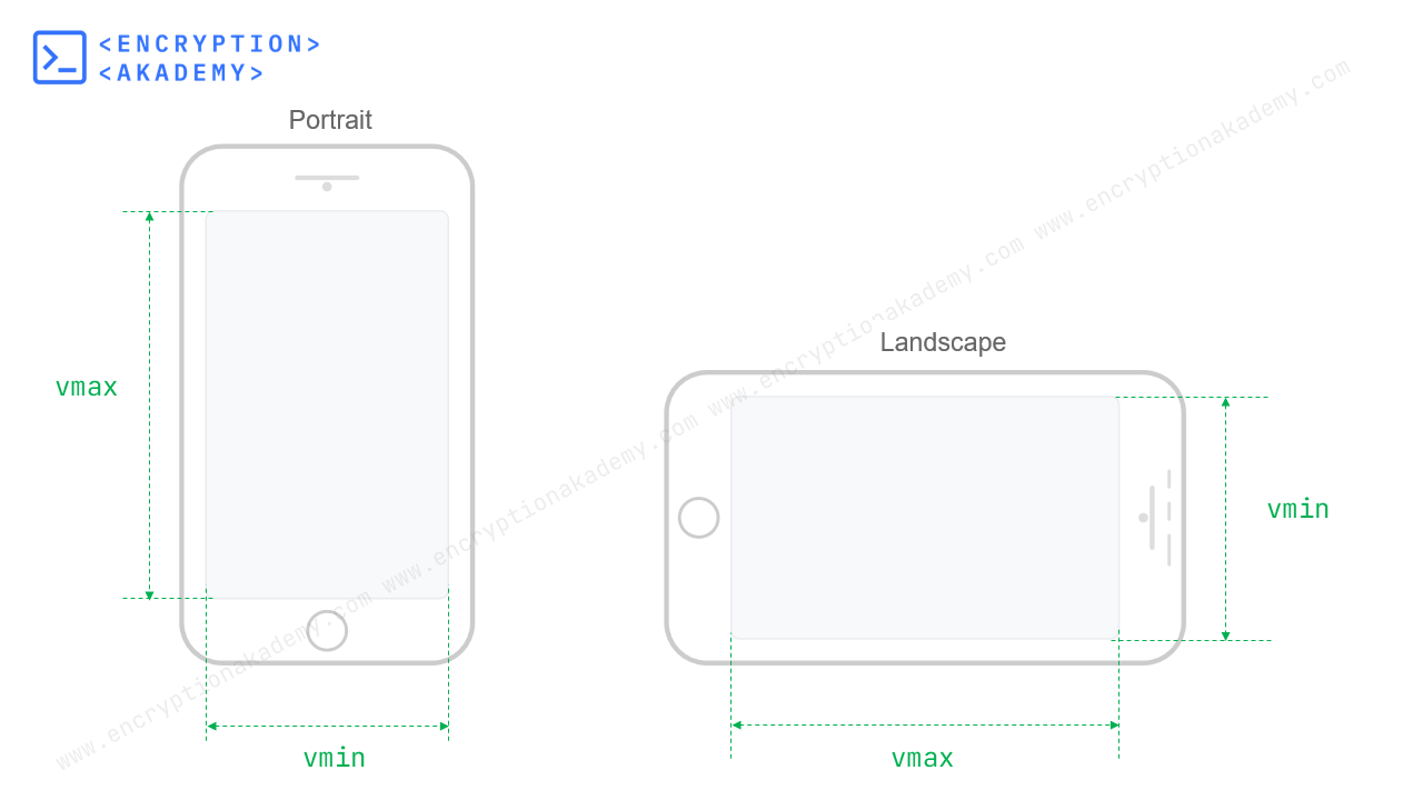
4. viewport maximum unit - vmax
vmax stands for viewport maximum. This unit refers to dimension of viewport which is larger(either height or width). 10vmax is equal to 10% of Larger dimension of viewport and 100vmin is full size of it.
For example consider viewport dimensions as 1920px x 1080px. So vmax here will refer to 1920px and 10vmax is calculated as 10% of 1920 which is equal to 192px.
Block And Inline Axis
Not all language in world starts at left side of line. Each language has has its own direction of text flow. For example Arabic languages are right-to-left in direction. Chinese or japanese Languages are written from top-to-bottom with new line added to left. To incorprate all these writing modes, CSS introduced two new properties vi and vb which depend on Inline and Block Axis.
Inline Axis is parallel to the flow of text. It is horizontal axis for horizontal witing modes and vertical for vertical witing modes. For example it is horizontal axis for English Language.
Block Axis is perpendicular to the flow of text. It is vertical axis for horizontal witing modes and horizontal for vertical witing modes. For example it is vertical axis for English Language.
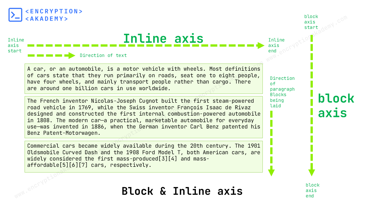
6. viewport inline unit - vi
vi stands for Viewport Inline. It has the same direction as Inline Axis. For horizontal writing mode it corresponds to width and for vertical writing mode it corresponds to height of viewport. 1vi is 1% of viewport size along inline axis.
7. viewport block unit - vb
vb stands for Viewport Block. It has the same direction as Block Axis. For horizontal writing mode it corresponds to height and for vertical writing mode it corresponds to width of viewport. 1vb is 1% of viewport size along block axis.
Viewport Unit Modifiers
All the above Viewport units works perfectly for desktop computers, but presents challenges on mobile devices. The viewport of mobiles changes due to the presence of scrollable toolbars. These toolbar generally consists of address bar, navigation bar and other. They contracts and expands on scrolling based on user input.

To overcome this problem, the various states of the viewport has been defined/specified and new units have been created based on these new viewport states. These new states and corresponding new units are listed below.
- Large Viewport - lvw, lvh, lvmin, lvmax, lvi, lvb
- Small Viewport - svw, svh, svmin, svmax, svi, svb
- Dynamic Viewport - dvw, dvh, dvmin, dvmax, dvi, dvb
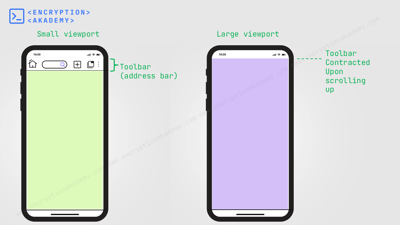
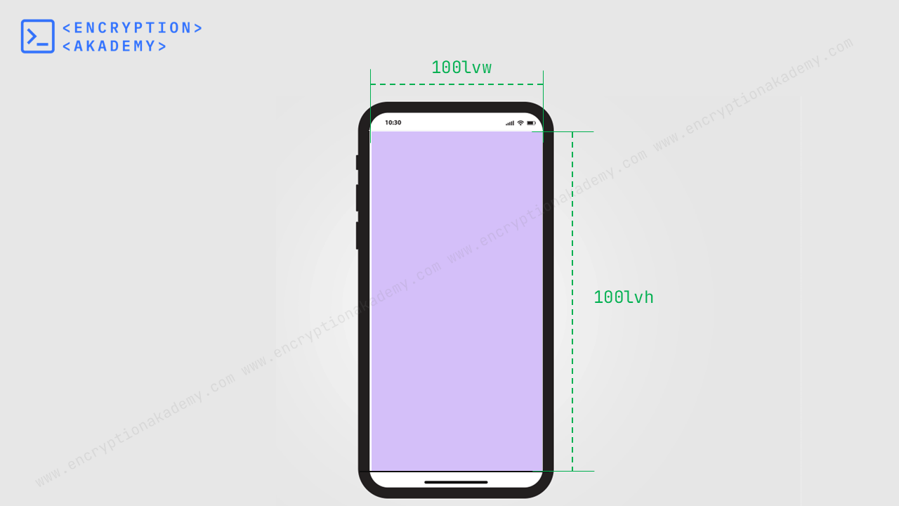
Large Viewport
Large Viewport is a state when all toolbars are contracted to their fullest extent. So the maximum screen area becomes available for page content.
The Large Viewport units allows developer to size an element by full viewport area. These units have the lv prefix followed by the six viewport units which we had seen earlier. The units are lvw, lvh, lvmin, lvmax, lvi, lvb. These units are described briefly in the below table.
| Unit | Full Name | Description | What it Represents |
|---|---|---|---|
lvw |
Large Viewport Width | 1% of the large viewport's width | Width when browser UI is hidden (maximum width available) |
lvh |
Large Viewport Height | 1% of the large viewport's height | Height when browser UI is hidden (maximum height available) |
lvi |
Large Viewport Inline | 1% of the large viewport's inline dimension | Inline direction size (typically width in horizontal text layouts) |
lvb |
Large Viewport Block | 1% of the large viewport's block dimension | Block direction size (typically height in horizontal text layouts) |
lvmin |
Large Viewport Minimum | 1% of the smaller dimension | Whichever is smaller between lvh and lvw |
lvmax |
Large Viewport Maximum | 1% of the larger dimension | Whichever is larger between lvh and lvw |
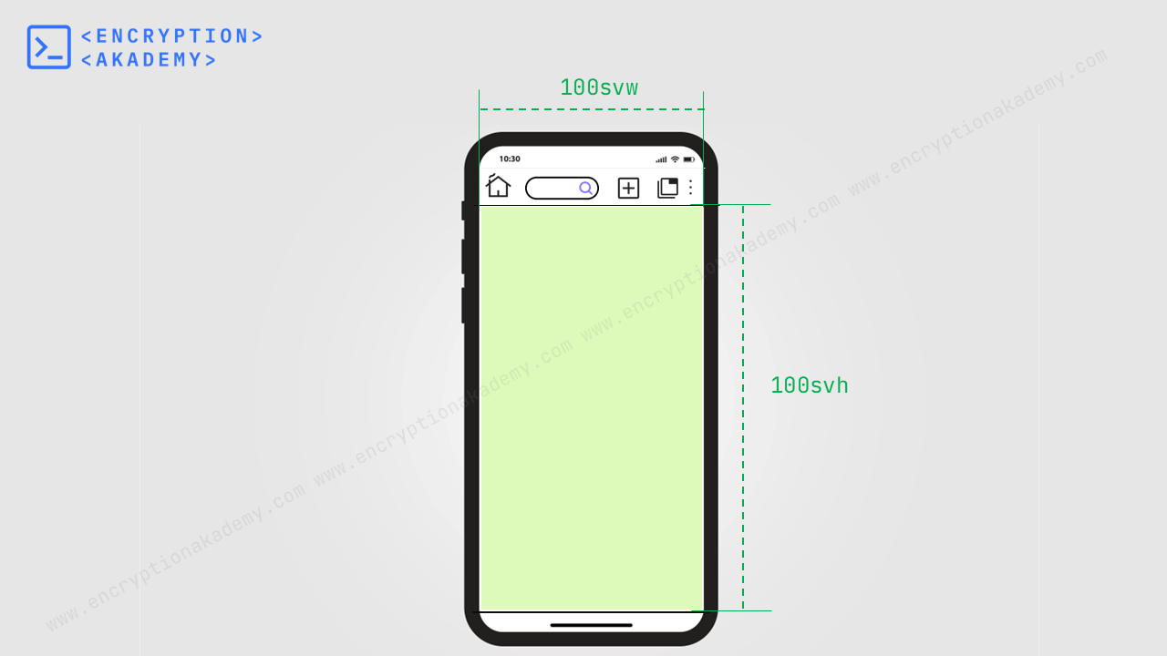
Small Viewport
Small Viewport is a state when all toolbars are expanded to their fullest extent. So the minimum screen area becomes available for page content.
The Small Viewport units allows developer to size an element in accordance to smallest viewport area. These units have sv prefix. The units are svw, svh, svmin, svmax, svi, svb. These units are described briefly in the below table.
| Unit | Full Name | Description | What it Represents |
|---|---|---|---|
svw |
Small Viewport Width | 1% of the small viewport's width | Width when browser UI is shown (minimum width available) |
svh |
Small Viewport Height | 1% of the small viewport's height | Height when browser UI is shown (minimum height available) |
svi |
Small Viewport Inline | 1% of the small viewport's inline dimension | Inline direction size (typically width in horizontal text layouts) |
svb |
Small Viewport Block | 1% of the small viewport's block dimension | Block direction size (typically height in horizontal text layouts) |
svmin |
Small Viewport Minimum | 1% of the smaller dimension | Whichever is smaller between svh and svw |
svmax |
Small Viewport Maximum | 1% of the larger dimension | Whichever is larger between svh and svw |
Dynamic Viewport
Dynamic Viewport is a state which is compatible with changes in the viewport. It adjusts itself according to UI changes by equating itself to current viewport.
- When all toolbars are expanded and viewport becomes smallest possible, then Dynamic Viewport becomes equal to size of Small viewport
- When all toolbars are contracted and viewport becomes largest possible, then Dynamic Viewport becomes equal to size of large viewport
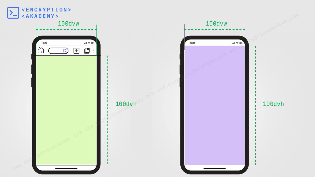
Dynamic Viewport units allows developer to set lenghts according to the size of viewport in every state. These units have dv prefix. The units are dvw, dvh, dvmin, dvmax, dvi, dvb.
| Unit | Full Name | Description | What it Represents |
|---|---|---|---|
dvw |
Dynamic Viewport Width | 1% of the dynamic viewport's width | Width that adapts as browser UI dynamically shows/hides |
dvh |
Dynamic Viewport Height | 1% of the dynamic viewport's height | Height that adapts as browser UI dynamically shows/hides |
dvi |
Dynamic Viewport Inline | 1% of the dynamic viewport's inline dimension | Inline direction size that adapts dynamically (typically width in horizontal text layouts) |
dvb |
Dynamic Viewport Block | 1% of the dynamic viewport's block dimension | Block direction size that adapts dynamically (typically height in horizontal text layouts) |
dvmin |
Dynamic Viewport Minimum | 1% of the smaller dimension | Whichever is smaller between dvh and dvw |
dvmax |
Dynamic Viewport Maximum | 1% of the larger dimension | Whichever is larger between dvh and dvw |
The number zero(0) is same in all units. When defining the value of an property to be zero, unit should not be omitted. So instead of writing "0" it should be written as "0px" or "0in".
Frequently Asked Questions (FAQ)
How to prevent 100vw from creating horizontal scroll?
2. Use calc(100vw - scrollbar width) Estimate and subtract scrollbar size manually:
.container {
  width: calc(100vw - 15px); /* adjust scrollbar width as needed */
}
.container {
  width: 100vw;
  max-width: 100%;
  box-sizing: border-box;
}
How to get the browser viewport dimensions?
const width = window.innerWidth;
const height = window.innerHeight;

console.log(`Viewport size: ${width} × ${height}`);
What Does 1vh Mean Inside an iframe?
What are viewport units in CSS?
| Unit | Stands For | Description | Use Case |
|---|---|---|---|
vw |
Viewport Width | 1% of the viewport’s current width | Responsive width layouts |
vh |
Viewport Height | 1% of the viewport’s current height | Full height sections |
vmin |
Viewport Minimum | 1% of the smaller viewport side (width or height) | Scale elements proportionally |
vmax |
Viewport Maximum | 1% of the larger viewport side (width or height) | Ensure larger fit scaling |
dvw |
Dynamic Viewport Width | 1% of dynamic viewport width (updates with scroll/UI) | Fix `100vw` scroll issues on mobile |
dvh |
Dynamic Viewport Height | 1% of dynamic viewport height (accounts for mobile browser UI) | Fix `100vh` issues on mobile |
lvw |
Large Viewport Width | 1% of largest possible viewport width | Pre-scroll full width reference |
lvh |
Large Viewport Height | 1% of largest possible viewport height | Consistent height even when UI overlays |
svw |
Small Viewport Width | 1% of smallest possible viewport width | Prevents layout shift on screen shrink |
svh |
Small Viewport Height | 1% of smallest possible viewport height | Fixes layout for minimized browser UI |
What is the difference between vmin and vmax in CSS?
1vmin = 1% of the smaller of viewport width (vw) or viewport height (vh)
1vmax = 1% of the larger of viewport width (vw) or viewport height (vh)
Are viewport units affected by the mobile browser address bar?
| Unit | Mobile-Safe? | Description |
|---|---|---|
vh |
No ❌ | Can include or exclude address bar depending on state |
dvh |
Yes ✅ | Always represents the visible height |
lvh |
Sometimes ☑️ | Full available height (when chrome is hidden) |
svh |
Sometimes ☑️ | Minimum height (when chrome is visible) |
Do vw and vh include scrollbars?
100vw = 100% of the entire browser width, including the vertical scrollbar (if present).
100vh = 100% of the entire browser height, including the horizontal scrollbar (if present).
How to make a div 100% height of the browser window?
Method 1: Using 100vh The most straightforward way is use 100vh as 100vh=100% of the viewport height. This method Works well on desktop.
.fullscreen {
  height: 100vh;
}
Method 2: Use 100dvh dvh stands for Dynamic viewport height. Always reflects the actual visible height — even when the mobile browser UI is showing/hiding. More accurate and reliable on mobile devices.
.fullscreen {
  height: 100dvh;
}